Discover the best interactive data visualization tools to supercharge your EDA process. Compare features, ease of use, and integration capabilities. Level up your data exploration skills now!
In today’s data-driven world, businesses and organizations rely on interactive data visualization tools to gain insights, identify trends, and make informed decisions. These tools offer dynamic visualizations that enable users to interact with data, explore patterns, and extract valuable information.
By using these tools, users can easily uncover hidden patterns, correlations, and outliers within their data sets. Furthermore, interactive data visualization tools facilitate the communication of complex data findings in a clear and intuitive manner, making it easier for stakeholders to understand and act upon the insights derived from the data analysis.
Key Features Of Interactive Tools
Interactive data visualization tools for EDA (Exploratory Data Analysis) offer many features. These features help users understand and interact with data easily. They make exploring data intuitive and fun. Here are some key features of these tools:
Real-time Interaction
Real-time interaction enables users to see changes instantly. Users can adjust filters, zoom in, or drill down into data. They get immediate feedback on their actions. This feature helps in making quick decisions based on data. It also enhances user engagement with the tool.
- Immediate feedback on data changes
- Ability to adjust filters and see results
- Zoom in and drill down capabilities
Customizable Dashboards
Customizable dashboards allow users to tailor their view. Users can select which data points to display. They can also choose different chart types. This helps in focusing on the most important data. A well-designed dashboard can improve data comprehension.
- Select data points to display
- Choose from different chart types
- Tailor the view to user needs
Here is a table summarizing the key features:
| Feature | Description |
|---|---|
| Real-time Interaction | Immediate feedback, filter adjustments, zoom, and drill down |
| Customizable Dashboards | Tailor views, select data points, and choose chart types |

Credit: www.leewayhertz.com
Popular Tools In The Market
Exploring data can be a complex task. Interactive data visualization tools simplify this process. They help in understanding patterns, trends, and insights. Below are some popular tools in the market.
Tableau
Tableau is a leading interactive data visualization tool. It offers powerful features and an intuitive interface. Users can create stunning visualizations with drag-and-drop functionality. Tableau supports various data sources. It includes Excel, SQL databases, and cloud services.
Key Features:
- Real-time data analysis
- Interactive dashboards
- Seamless integration with multiple data sources
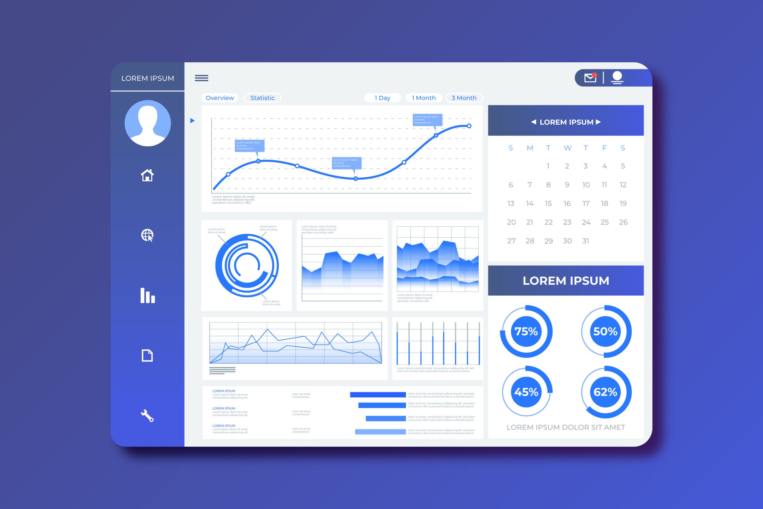
Here’s a simple example of a Tableau dashboard:
html
Power Bi
Power BI by Microsoft is another popular tool. It allows users to visualize data and share insights. Power BI integrates with various Microsoft services. It is ideal for business intelligence tasks.
Key Features:
- Customizable dashboards
- AI-powered data insights
- Easy collaboration and sharing
Power BI also supports various data connectors. It allows easy data import from different sources.
Plotly
Plotly is an open-source data visualization tool. It is well-suited for creating interactive graphs. Plotly supports various programming languages. This includes Python, R, and JavaScript.
Key Features:
- High-quality interactive plots
- Support for various data formats
- Customizable and exportable graphs
Plotly provides a flexible and user-friendly interface. It is perfect for developers and data scientists.
| Tool | Key Features | Ideal For |
|---|---|---|
| Tableau | Real-time analysis, interactive dashboards | Business users, analysts |
| Power BI | Customizable dashboards, AI insights | Business intelligence tasks |
| Plotly | High-quality plots, support for multiple languages | Developers, data scientists |
Comparing Interactive Tools
Interactive data visualization tools make exploratory data analysis (EDA) engaging and insightful. Comparing these tools helps in choosing the best one. Let’s dive into the aspects of ease of use and integration capabilities.
Ease Of Use
Ease of use is crucial for data visualization tools. Here is a comparison of some popular tools:
| Tool | Learning Curve | User Interface |
|---|---|---|
| Tableau | Moderate | Drag-and-drop |
| Power BI | Low | Intuitive |
| Plotly | High | Script-based |
- Tableau offers a drag-and-drop interface. It requires some learning.
- Power BI is user-friendly. It has a low learning curve.
- Plotly involves scripting. It needs more learning.
Integration Capabilities
Integration capabilities are vital for seamless data workflows. Below is a comparison:
| Tool | Data Sources Supported | API Availability |
|---|---|---|
| Tableau | Multiple (Excel, SQL, etc.) | Yes |
| Power BI | Wide Range (Azure, Excel, etc.) | Yes |
| Plotly | Numerous (Python, R, etc.) | Yes |
- Tableau supports many data sources. It provides a robust API.
- Power BI integrates well with Microsoft services. It has an API.
- Plotly works with Python and R. It also offers an API.
Creating Visualizations
Creating visualizations helps you understand data patterns quickly. Interactive data visualization tools are essential for effective exploratory data analysis (EDA). This section guides you through the process of creating visualizations using these tools.
Step-by-step Guide
- Import Your Data: Load your dataset into the visualization tool.
- Choose a Chart Type: Select the chart that best represents your data. Common types are bar charts, line graphs, and scatter plots.
- Customize Your Chart: Adjust colors, labels, and scales. Make it easy to read.
- Add Interactivity: Enable tooltips, zoom, and filters. This makes your chart more engaging.
- Review and Export: Look at your chart. Make sure it’s clear. Export it in the desired format.
Best Practices
- Keep It Simple: Avoid clutter. Simple charts are easier to understand.
- Use Color Wisely: Use contrasting colors for better visibility.
- Label Clearly: Make sure all axes and data points are labeled.
- Interactive Elements: Add features like tooltips and zoom. They enhance user experience.
- Test Your Visualizations: Check with different datasets. Ensure your chart works well.
| Tool | Best For |
|---|---|
| Tableau | Complex visualizations and dashboards |
| Power BI | Business analytics and reporting |
| Google Data Studio | Interactive reports and dashboards |
Case Studies
Interactive Data Visualization Tools are revolutionizing how we understand data. These tools help in simplifying complex datasets, making them more comprehensible. Let’s explore some case studies where these tools have made a significant impact.
Business Analytics
Businesses often deal with vast amounts of data. Interactive data visualization tools assist in making sense of this data. They provide clear and concise insights.
For example, a retail company used a data visualization tool to analyze sales data. They discovered which products sold best in each region. This helped them focus their marketing efforts effectively. The visual representation made it easy for stakeholders to understand the trends. It also helped in making quick, data-driven decisions.
| Region | Top-Selling Product | Sales Growth |
|---|---|---|
| North America | Electronics | 15% |
| Europe | Fashion | 20% |
| Asia | Home Appliances | 25% |
Interactive dashboards were used to monitor real-time sales data. This allowed the company to react swiftly to market changes.
Healthcare Applications
In healthcare, data visualization tools are crucial. They help in identifying patterns and trends. This can lead to better patient outcomes.
A hospital used these tools to track patient data. They analyzed data on patient admissions, treatment outcomes, and recovery times. This helped them identify areas needing improvement.
- Reduced patient wait times
- Improved treatment plans
- Enhanced patient satisfaction
Heatmaps were used to visualize patient flow in the hospital. This helped in optimizing resource allocation. The hospital also used line charts to track recovery times. This made it easier to identify effective treatments.
Interactive data visualization tools have proven to be invaluable in healthcare. They ensure data is used effectively to improve patient care.
Challenges And Solutions
Data visualization is essential for Exploratory Data Analysis (EDA). It helps uncover patterns and insights. Yet, interactive data visualization tools come with their own set of challenges. Understanding these challenges and finding solutions can enhance your EDA experience.
Common Issues
Many users face performance issues with interactive data visualization tools. Large datasets can slow down rendering times. This hampers the overall user experience.
Another issue is compatibility. Not all tools work well on every platform. This can limit accessibility and usability.
Users often struggle with complexity. Advanced features can be difficult to understand and use effectively. This steep learning curve can deter new users.
Lastly, there is the matter of cost. Some powerful tools come with high subscription fees. This can be a barrier for small teams or individual users.
Overcoming Obstacles
To tackle performance issues, consider data preprocessing. Reduce the dataset size before visualization. Use efficient algorithms for rendering. This can significantly improve speed.
For compatibility, choose tools that offer cross-platform support. Check if the tool integrates well with other software you use. This ensures a smoother workflow.
Addressing complexity requires user training. Provide detailed documentation and tutorials. Many tools offer online courses and community support. Leverage these resources to lower the learning curve.
To mitigate cost concerns, explore open-source options. Many free tools offer robust features. Evaluate your needs and choose a tool that fits your budget.
Here’s a quick comparison of popular tools:
| Tool | Performance | Compatibility | Complexity | Cost |
|---|---|---|---|---|
| Tableau | High | Cross-Platform | Moderate | High |
| Power BI | Moderate | Windows | Moderate | Moderate |
| Plotly | High | Cross-Platform | Low | Free |
Future Of Data Visualization
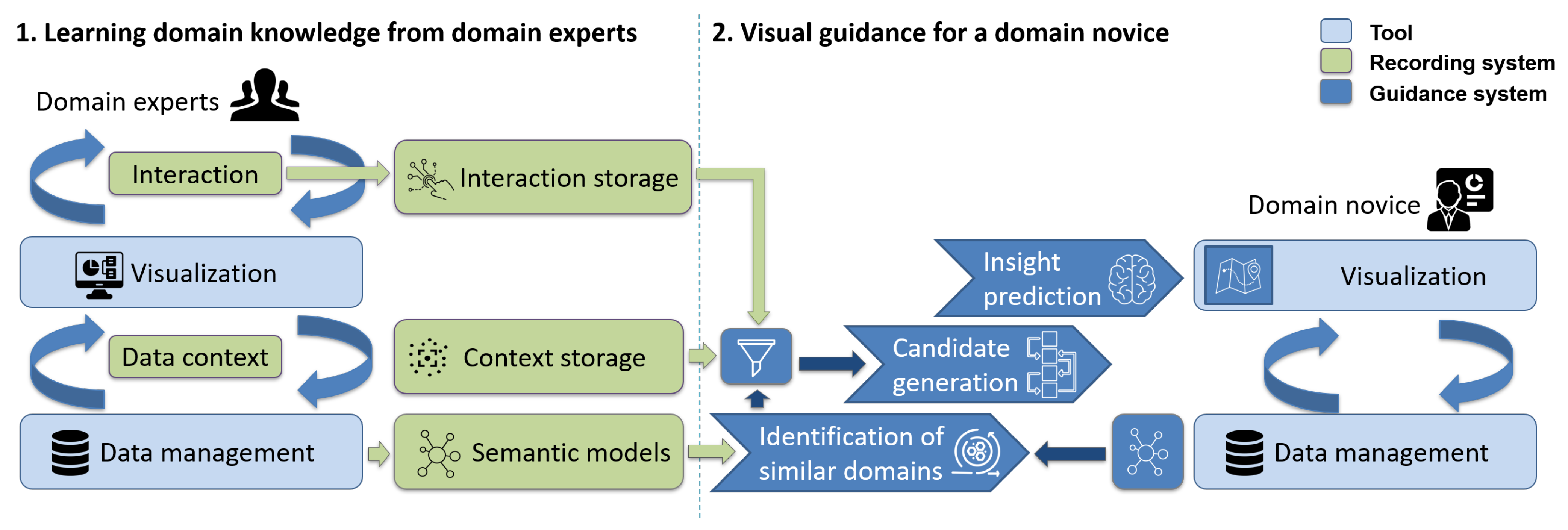
The future of data visualization lies in interactive tools for exploratory data analysis (EDA). These innovative solutions empower users to interact with data for deeper insights and better decision-making. With user-friendly interfaces and real-time updates, interactive data visualization tools are revolutionizing data analysis processes.
Emerging Trends
The future of data visualization is exciting and filled with emerging trends. One trend is the increasing use of virtual reality for data representation.
Another trend is the integration of augmented reality into data visualization tools, enhancing user experiences.
Impact Of Ai
Artificial Intelligence is revolutionizing data visualization by offering automated insights and predictions.
AI algorithms help in pattern recognition and data analysis, making visualizations more meaningful.
In summary, the future of data visualization is driven by emerging trends and the impactful integration of AI.
Credit: www.mdpi.com

Credit: medium.com
Frequently Asked Questions
What Tool Is Used For Eda?
Popular tools for EDA include Python libraries like Pandas, Matplotlib, and Seaborn. R also offers ggplot2 and dplyr.
Can Tableau Be Used For Eda?
Yes, Tableau is excellent for Exploratory Data Analysis (EDA). It offers interactive visualizations, making data insights easy to discover.
How To Analyze Eda Data?
Analyze EDA data by cleaning, exploring, and visualizing it. Use tools like Python, R, and visualization libraries. Identify patterns, trends, and correlations.
What Graphs Are Used In Eda?
Common graphs in EDA include histograms, scatter plots, box plots, bar charts, and heatmaps. These visualizations help identify patterns, relationships, and outliers in the data.
Conclusion
Choosing the right interactive data visualization tool is crucial for effective EDA. These tools enhance data analysis and presentation. They provide insights that drive informed decisions. Explore various options and pick the one that suits your needs. Stay ahead by leveraging these powerful visualization tools.
Happy data analyzing!

